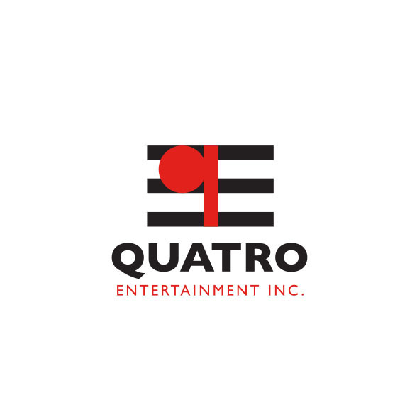
Quatro Entertainment
This entertainment company markets and produces traveling music and live performance shows across the world. Using the “q” for Quatro we placed it on three lines of a music score. The logo implies a note on a musical score. We also gain an “E” on the other side.
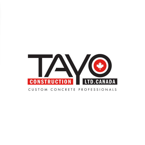
Tayo Construction
Tayo Construction provides commercial and private cement construction applications. The two bars represent forms and the Y pours cement into those forms is the gist of this logo.
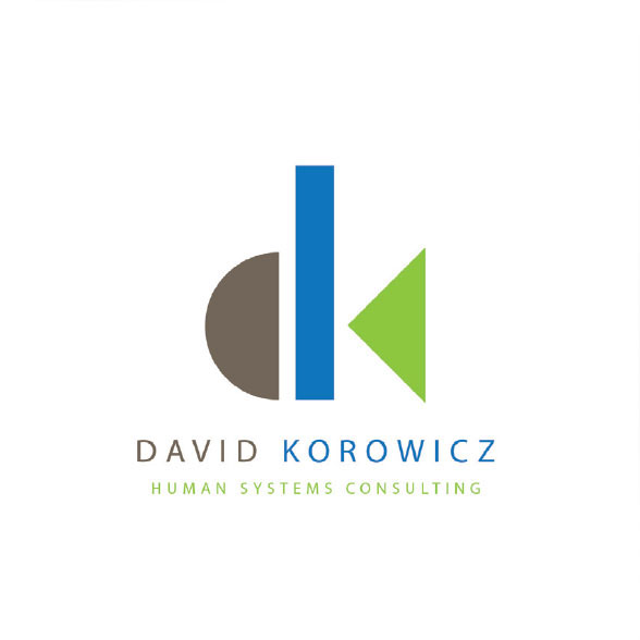
David Korowicz
David Korowicz, is a professor and educator of how companies interact with the world. What damage they cause and how to mitigate this. The logo represents the world (brown), sky or water (blue), and vegetation (green). The simplified shapes create “d” and “k”.
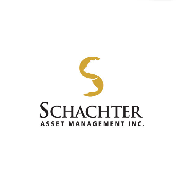
Schachter Asset Management
Designed in the 90s, this logo has stood the test of time and is still used today. A simple logo depicting the bear and bull financial markets in the negative space of an S. This logo was ahead of its time as no other logo existed like this
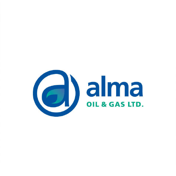
Alma Oil and Gass
Oil and gas company. Design was based on showing the letter ‘A’ and drilling into the earth. This logo was designed in 1990 and still works in today’s market. Using the @ symbol in a logo was the first application in the world. Already forseeing the future.
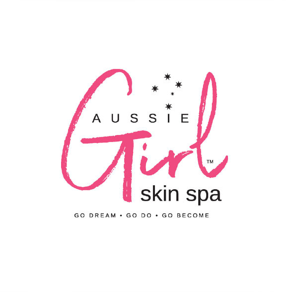
Aussie Girl Skin Spa
The core idea behind the Aussie Girl Skin Spa identity was developing an image that was fun and inviting. The 5 star Southern Cross constellation was inserted above the “I” to add a little bit of Australia to the logo since the owner is Australian.