Sonas Med-Spa
Spa logos are always nice to do as you can create a feeling rather than any direct depiction of something. The S swirl divides the oval into soothing hues of green and aqua. An overall feeling of water and sea foam.


Spa logos are always nice to do as you can create a feeling rather than any direct depiction of something. The S swirl divides the oval into soothing hues of green and aqua. An overall feeling of water and sea foam.
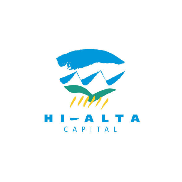
Hi-Alta Capital is a financial institution delivering investment products to the rural investor. This award-winning logo was developed to symbolize the Alberta landscape of blue skies, mountains, rolling hills, and fertile plains.
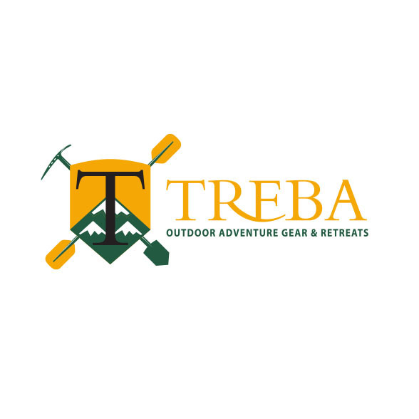
The concept behind this logo was badges, Boy Scouts, and national parks of the 50s. Incorporating camping and water sport activities, this logo inspires the words "Get Out There".
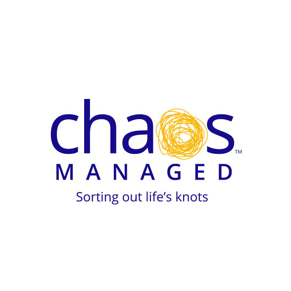
We developed both the logo and the slogan. This company helps individuals as well as companies organize themselves. Substituting the “o” for a scribble symbolizes the chaos they manage.
Deak International is a financial organization dealing with gold assets. In this logo, we symbolize power and strength in the financial markets.
The client for this company guides businesswomen and women who want to be business savvy to succeed. A woman holds the world and is advancing to her future life.
This carpentry company does finishing work for homes. Solid work and perfection is symbolized here. The 3D effect lends a uniqueness to this brand.
Putnam is a fuel oil supplier for homes in the state of New Hampshire, USA. The logo symbolizes this graphically, integrated with text.
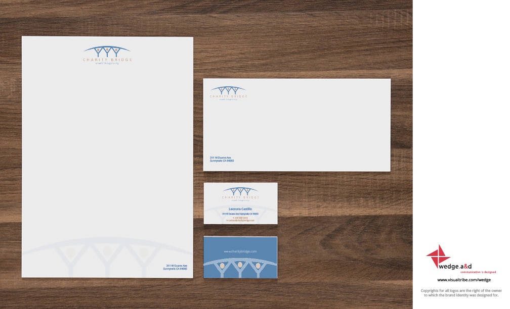
Charity Bridge connects the right business to the right charity and “bridges” the gap between them. The brand identity shows individuals holding up a bridge that connects two sides.
Chance Saint Marche is a fashion brand for young adult men based in London, England. We utilized the male XY chromosome to build a person ready to take on the world.
This Realtor logo uses the “T” and “M” of Tammy’s name to create a house and garage. A simple and modern take on a Realtor logo.
Griffith Gray is a global financiering company situated in London, England. It develops and markets private equities. The logo depicts the world constructed of interlocking Gs showing strength.
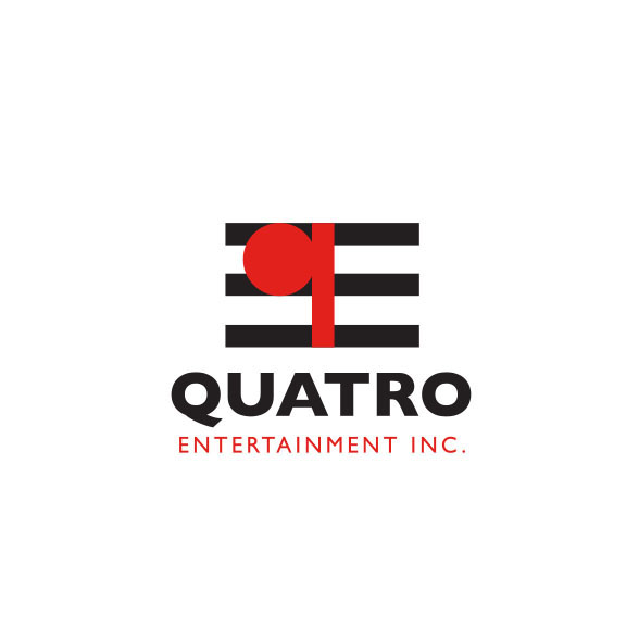
This entertainment company markets and produces traveling music and live performance shows across the world. Using the “q” for Quatro we placed it on three lines of a music score. The logo implies a note on a musical score. We also gain an “E” on the other side.
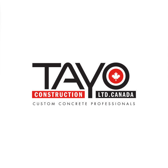
Tayo Construction provides commercial and private cement construction applications. The two bars represent forms and the Y pours cement into those forms is the gist of this logo.
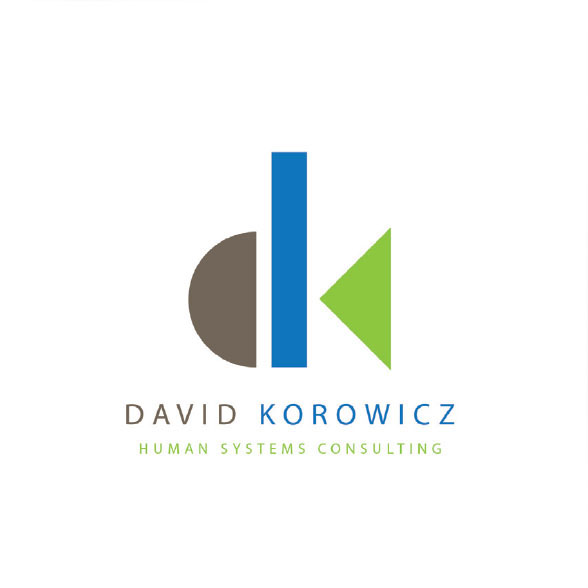
David Korowicz, is a professor and educator of how companies interact with the world. What damage they cause and how to mitigate this. The logo represents the world (brown), sky or water (blue), and vegetation (green). The simplified shapes create “d” and “k”.
Designed in the 90s, this logo has stood the test of time and is still used today. A simple logo depicting the bear and bull financial markets in the negative space of an S. This logo was ahead of its time as no other logo existed like this
Oil and gas company. Design was based on showing the letter ‘A’ and drilling into the earth. This logo was designed in 1990 and still works in today’s market. Using the @ symbol in a logo was the first application in the world. Already forseeing the future.
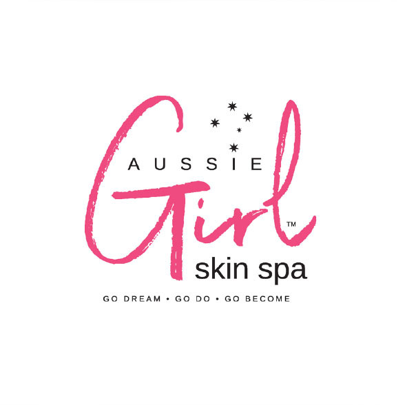
The core idea behind the Aussie Girl Skin Spa identity was developing an image that was fun and inviting. The 5 star Southern Cross constellation was inserted above the “I” to add a little bit of Australia to the logo since the owner is Australian.